What we’ve done
-

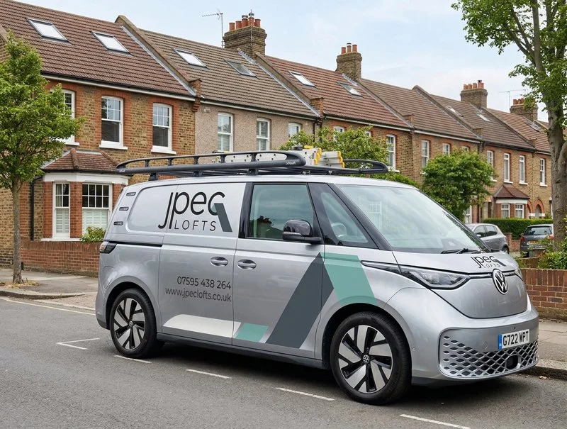
JPEC Lofts
Brand, Website & SEO & Google Ads
-

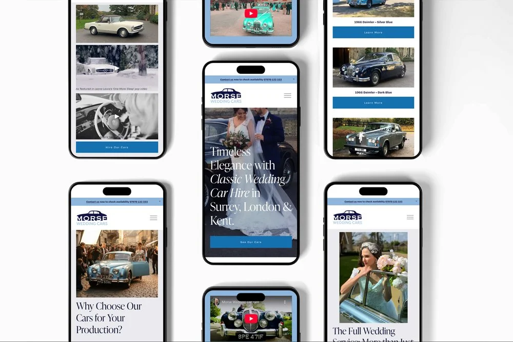
Morse Wedding Cars
Logo Design, Website & Development
-

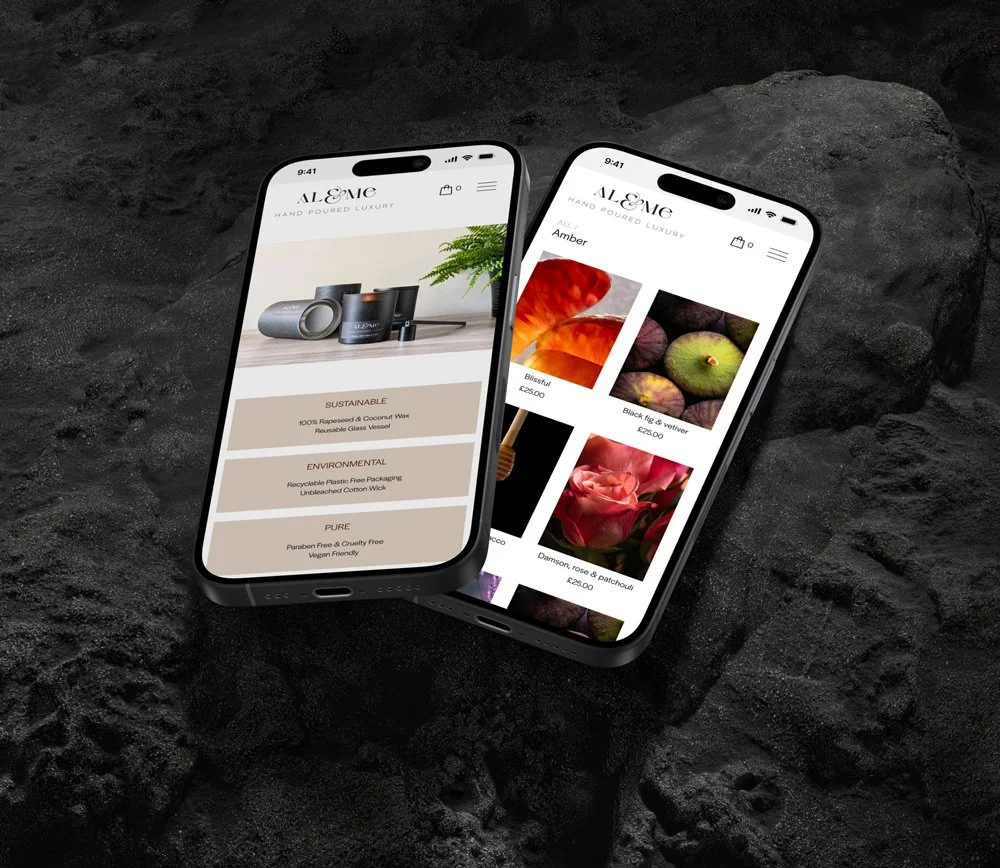
Al & Me Luxury Candles
Website design and development
-

JEDS Driving School
Website design and development
-

Wickhams Group
Website & Logo Design and development
Other Graphic Design & Digital Projects
-

NHS Bromley Healthcare
What their vision is
Bromley Healthcare, offer talking therapies which are speciaist support for adults helping people come to terms with and manage their mental fitness. They advertise these services locally on posters, leaflets, signage and on the side of buses. They want to communicate the services without predjudice and in an inclusive way.
What we bring to the table
We suggested that using simple emotive icons, that are very familar to people from their mobile phones, woud be a good way to show emotions without having photos of people that quickly date and feel a bit depressing. We worked closely with the promotion team who loved our concept and were keen to have a number of scenarios created (see some examples below).
What we’re creating together
We were soon asked to create leaflets and signage in this new style so they could start to advertise these much needed services across the borough.
Emotion Scenarios
Stressed, Financial Worries, Sadness / Loneliness
-

Bird in Bush Primary School
What their vision is
Bird in Bush Primary School, situated in Peckham, London, is a newly established primary school. With the aim of providing a nurturing learning environment, they sought to establish a strong brand identity right from the start. As seasoned designers, we were thrilled to collaborate with them in crafting a distinctive visual identity that would resonate with their pupils, parents, and the local community.
What we bring to the table
Bird in Bush Primary School, poised to make its mark in the education landscape, required a logo design that would effectively convey their ethos and values. Our expertise enabled us to create a logo that not only captures the spirit of the school but also appeals to its diverse audience. Through careful consideration of design elements we crafted a logo that reflects the school's commitment to excellence and inclusivity.
What we’re creating together
Our journey with Bird in Bush Primary School began with the exciting task of designing their brand new logo. We have gone on to create their website and promotional materials including a prospectus.
-

The HUB Coffee Shop
What their vision is
The HUB Coffee Shop, a new social enterprise nestled within the West Wickhams & Shirley Baptist Church in West Wickham, serves as a beacon of community engagement and warmth. Envisioned as a gathering place for locals to connect over coffee and conversation, The HUB sought to establish a distinctive brand identity reflective of its inclusive and welcoming atmosphere.
What we bring to the table
Eager to support this endeavour, we embarked on a creative journey to design a logo, signage, and aprons that would embody the essence of The HUB and resonate with its patrons. The HUB Coffee Shop, poised to become a cornerstone of community life, required a visual identity that would encapsulate its values and mission. Our signage design complements the architectural aesthetics of the coffee shop, inviting passersby to step inside and experience its inviting ambiance. Additionally, our apron design strikes the perfect balance between style and functionality, ensuring that staff members embody The HUB's brand identity with pride.
What we’re creating together
Our collaboration with West Wickham & Shirley Baptist Church is one of many having worked with them many times to provide website design and support, leaflet and marketing materials.
-

The Physiotherapy & Sports Clinic
What their vision is
The Physiotherapy & Sports Clinic are a team of highly experienced Chartered Physiotherapists. They specialise in ‘hands-on’ physiotherapy providing treatment and advice following injury, surgery or gradual onset of pain and restriction. The clinic had come into new ownership – so they wanted some thoughtful creative help to develop a fresh new website that would look great, feel positive and inclusive, and respect the ethos practice.
What we bring to the table
As they work with younger service-users through the sports injury offering they realised the site would need to simplify and excel on mobile devices. So we bring a ton of knowledge and experience to the table of how to communicate simply and effectivley. Distilling content from a much larger, older site down to it's essential key message takes real expertise, not to mention all of our brilliant design and development skills as well, obviously.
What we’re creating together
We’ve been working with The Physiotherapy & Sports Clinic since 2013, when we began by creating the intial website for the previous owners. Now we’ve helped the current owners with a big website redesign and continue to support them with content updates and improvements.
-

Metfilm School
What their vision is
Metfilm, the prestigious film school situated in London, stands as a beacon of excellence in the global film industry. Drawing students from across Europe and beyond, Metfilm is renowned for its commitment to nurturing talent and fostering innovation. Tasked with creating a prospectus that reflects the school's esteemed reputation, we eagerly embarked on a journey to design a captivating publication that showcases Metfilm's unique offerings and distinguishes it as a leader in film education.
What we bring to the table
Metfilm Prospectus, synonymous with quality and innovation, required a prospectus that would convey its status as a center of excellence in the film industry. Leveraging our design expertise, we conceptualised a prospectus that not only captures the essence of Metfilm's educational philosophy but also resonates with prospective students from diverse backgrounds. Through meticulous attention to detail and creative ingenuity, we crafted a visually stunning publication that serves as a testament to Metfilm's commitment to fostering creativity.
What we’re creating together
Our collaboration with our partner Agency Contra and Metfilm encompasses the creation of a prospectus that serves as a gateway to the world of filmmaking. From design conception to content creation, each aspect of the prospectus is meticulously crafted to showcase Metfilm's prestigious programs, state-of-the-art facilities, and esteemed faculty.
-

Vanalytical
What their vision is
Vanalytical Recruitment, started in 2024 by it’s founder Vanessa Morille was born out of a desire to create a recruitment agency that focussed on the individuals and their personalities. Having spent the whole of her career in the administration area, she has experience in a wide variety of sectors including Law, Technology and Finance. Vanalytical Recruitment needed a creative team to help them build a website that truly reflects their mission and identity.
What we bring to the table
We love making things look good and communicate well, and always take the time to get to know our clients and understand the personality they’re trying to convey and the audiences they’re hoping to engage. So it felt like a great fit with Vanalytical from day one. We worked closely with Vanessa, who was, and is, incredibly organised. She made working on this project a real pleasure for us.
What we’re creating together
We started working with Vanalytical to design their brand and logo and go on to build a completely new website and host it. Vanalytical are a pleasure to collaborate with and we've received really great feedback about their website from many other companies, praising its functionality, design, and user experience. This positive reception reaffirms the success of our collaborative efforts and motivates us to continue enhancing their digital presence.
-

Marian Vian Primary School
What their vision is
Marian Vian is one of four primary schools in Bromley who are part of the Compass Academy Trust. This large primary school is lucky to have vast outdoor space which includes woodland, a large pond and a playing field. They are very passionate about outdoor learning – inspiring, challenging and supporting children to develop practical learning and problem solving in a different context from the classroom. Participation in exciting and enjoyable outdoor activities reinforces a positive attitude to education and contributes significantly to the general ethos of the school.
What we bring to the table
They wanted help to set up a brand for their ‘Outdoor Learning School’, giving them the opportunity to invite other schools to use their facilities which in turn helps support a full-time Bushcraft instructor. As soon as we started to work with Marian Vian they quickly realised that Cahoot could improve all of their other materials and communications. We now work with them on many different projects and have become a valuable source of ideas and inspiration. We help them to show their community and prospective parents what an amazing educational experience they offer children.
What we’re creating together
As well as the aforementioned projects we've helped them set up a positive presence on social media, designed a mini-prospectus – which included a full-day photoshoot which perfectly showcases the school’s day-to-day life – and helped them win vital funding for community projects.
-

east to west
What their vision is
Surrey-based charity east to west are supporting over 1,400 struggling children, young people and their families, working through local schools to offer help in both emotional and practical ways. They’ve been doing amazing work in their community for 20 years and have built up a great reputation and lots of positive relationships – but they were starting to feel that their marketing materials hadn’t quite moved on from where they were in the 90s. So they wanted to partner with an agency who would respect the brand that had become so familiar and trusted locally, while also helping them look and feel more attractive and contemporary.
What we bring to the table
We’re a great fit for a tiny but mighty charity like east to west because we’re not so big ourselves – which means we can be very flexible and slot in and out of their existing team whenever they need us. We’re also really used to working with smaller organisations who have a lot of local engagement and brand recognition in their community, so we’ve gotten good at creating materials that look great but still fit within the overall visual style that their audience recognise.
What we’re creating together
Our first project with these guys was sprucing up their bi-annual newsletter, both in terms of modernising the design and helping to make sure the content was relevant, engaging and well-organised. The new-look newsletter went down so well with their supporters for the first time ever it's brought in much needed funds and they’ve asked us to stick around and help them improve other bits of their regular comms. So we’ll be working on all kinds of small but creative pieces together over the next year, from leaflets to fundraising appeals, all designed to inspire and encourage their audience about the brilliant impact of their work.
